Hello There!
Hubject is a global leader in eMobility interoperability, and our brand voice is the bridge between our technical excellence and the diverse stakeholders who shape the industry's future.
Our brand and its reputation are crucial assets. They represent not just our technical capabilities, but our commitment to making electric vehicle charging seamless, accessible, and universal. In an industry where complexity can create barriers, our voice breaks them down.
Our brand reflects our expertise in charging interoperability and our values as a global connector of the eMobility ecosystem. It speaks to charge point operators in Berlin, automakers in Detroit, policymakers in Brussels, and drivers everywhere who deserve charging experiences as simple as plugging in their phones.
Therefore, treat our brand with respect. Help build our brand reputation by using these guidelines to communicate consistently, clearly, and compellingly across every touchpoint.
Every product page, LinkedIn post, white paper, and email represents Hubject to the world. Inconsistent communication dilutes our authority and confuses our stakeholders. These guidelines ensure that whether someone encounters us at a conference in Tokyo, reads our white paper in Stockholm, or follows us on social media in San Francisco, they experience the same confident, accessible, forward-thinking voice that defines who we are.
The Hubject brand and its assets are valuable and protected by trademark, copyright, and other intellectual property laws. When you have questions about brand usage, please contact the marketing team for clarity and guidance.
These guidelines ensure we consistently communicate who we are: the global leader in charging interoperability, committed to making complex technology accessible and transformative.
Our voice pillars (Expert Clarity, Practical Innovation, Collaborative Leadership, and Market Enablement) are practical filters that help us communicate effectively with diverse stakeholders. Consistent voice builds trust. The goal is consistency in character, not uniformity in execution.
Questions or Guidance:
Contact the Marketing team for content review, clarification on guideline application, or exception requests.
Brand Foundation
01 Brand Overview
The eMobility industry exists in a state of constant technical evolution, where new protocols, standards, and regulations emerge faster than most stakeholders can absorb them. Hubject sits at the intersection of this complexity, connecting charge point operators, automotive manufacturers, service providers, and policymakers who all operate from different perspectives and prioritize different outcomes. Clear, authoritative communication isn't peripheral to our work, it's central to our role as the ecosystem's interoperability leader. Our brand must serve three critical functions:
Our voice must serve multiple critical functions:
Building
Trust
Our communication demonstrates the technical expertise and accountability our partners require.
Driving
Adoption
Every stakeholder, from CPOs to journalists to policymakers, influences EV adoption. Our communication must show how interoperability removes barriers that hold back widespread EV adoption.
Leadingthe Industry
As the global interoperability leader, our voice should set the standard for how eMobility innovation is communicated: with clarity, vision, and human relevance.
02 Mission and Vision

Our Mission
To enable seamless EV charging and drive sustainable mobility adoption worldwide.
Our Vision
A connected, interoperable eMobility ecosystem where charging is seamless, sustainable, and accessible to all.
03 Core Values in Action
Our core values aren’t abstract concepts. They’re communication principles that shape every message we create.


We are Curious
Our curiosity drives continuous innovation and exploration of new possibilities in eMobility. In communication, this means we share what we’re learning and exploring, not just what we’ve achieved. We ask provocative questions that spark industry dialogue and invite stakeholders into our innovation process.


We are Ambitious
Our drive for excellence demands confident, aspirational language that motivates partners while maintaining technical credibility. We frame our work as transformative achievements that advance the entire ecosystem, setting bold visions for the industry’s future while celebrating each milestone as a step toward larger goals.


We are Accountable
Our commitment to accountability demands precise, measurable language that demonstrates ownership of outcomes. We provide specific metrics and commitments rather than vague promises, acknowledge challenges honestly, and take ownership of both successes and areas for improvement.
We are Inclusive
Our inclusivity means communicating in ways that serve diverse stakeholders, from independent operators to multinational manufacturers. We avoid jargon that excludes non-technical audiences, acknowledge diverse use cases and operational scales, and demonstrate how our solutions serve different stakeholder needs.
Visual Identity
04 Logo & Symbol
The Hubject dash draws its origin from road markings that guide drivers safely along their path. On roads worldwide, directional dashes appear before curves and transitions, directing eyes to follow the safe route before hands turn the wheel. They provide clarity in moments of change, ensuring smooth passage through complex infrastructure.
This guidance principle defines Hubject's role in the eMobility ecosystem. We direct the flow of connectivity between disparate charging networks, creating clear pathways through technical complexity. The dash's forward angle represents the seamless transfer of energy, data, and authentication that interoperability enables.
Primary logo

Teal Dash
Logo with a teal dash and black writing is our primary logo.

Teal Dash
Logo with a teal dash and white writing can also be used on a dark background.
Color variations

Black
Logo in black on Hubject teal is our primary logo.

White
Logo in white can be used on black background.
Clearspace

Always ensure that the designated amount of space surrounding the logo is maintained.
Incorrect Usage


Do not use old logo


Do not resize the dash

Do not change angle of the dash

Do not rotate the logo

Do not change the color of the dash

Do not outline the logo

Do not place the dash at the end

Do not reverse the dash

Do not add gradients to the logo
05 Sub-Brands
Hubject's sub-brands extend our interoperability expertise into specialized domains. With the Hubject brand at their core legitimizing their authority, each maintains our established voice while adapting to the specific requirements of their operational contexts. Together, they form a portfolio of products that endeavors to meet the needs of the eMobility ecosystem.
Hubject Financial Services
Hubject Financial Services operates with the authority that regulatory compliance demands. As a BaFin-licensed payment institution, HFS maintains the rigorous standards required of financial services entities operating across European jurisdictions. This regulatory standing isn't incidental. It defines the brand's character: authoritative, compliant, and built on the institutional trust that cross-border financial operations require.
In an industry where payment processing intersects with evolving regulatory frameworks, HFS represents certainty. The brand communicates institutional credibility and regulatory expertise, positioning HFS not as a technology vendor but as a licensed financial partner capable of navigating complex compliance landscapes while enabling seamless eMobility transactions.


Hubject Testing Facility
Hubject Testing Facility embodies technical expertise as an enabling force for the eMobility sector. HTF positions itself as the authoritative validation partner, the certification gateway that ensures interoperability functions as promised before solutions reach operational networks. This is a brand built on precision, technical depth, and the specialized knowledge required to validate complex protocol interactions.
HTF communicates as the expert facilitator: technical yet accessible, rigorous yet collaborative. The brand serves as the industry's certification standard-bearer, providing the validation infrastructure that allows OEMs, CPOs, and technology providers to confidently deploy solutions knowing they've been tested against real-world interoperability requirements by Europe's leading protocol experts.


06 Key Visuals
Dots Key Visuals
The dot grid is a supportive element, built to extend across touchpoints: cards, social, decks, wherever the brand needs a quiet backdrop rather than a statement.
Every dot is a participant: a charge point, a vehicle, a session, rendered plain and uniform, because no single player outranks the network. It all sits on a grid, with dots scaling up or down frame to frame, the same logic as the electric grid itself.
Dots Key Visuals
The dots stay equal in size within each grid, some filled and some outlined, across a handful of tints. A few carry icons instead of color alone: a vehicle, a plug, a battery, marking specific parts of the system without turning it into a diagram.
Basic grid structure


Use examples


Cutout Key Visuals
This is the dot grid applied to a real touchpoint.
Some dots are cut out of the flat color to reveal photography underneath, others sit as solid color directly on top of a photo. Same grid, same equal-sized dots as the key visual, just working two ways at once. It's how the abstract brand system and real-world photography share one layout without either breaking the pattern.


Lines patterns
The line pattern is the hero version of the same system, built for the moments that need more presence: heroes, covers, key touchpoints.
Each line is a route through the network: a roaming session, a handshake between systems, a path the interoperability layer holds together. They bend only at clean right angles, like circuit traces, because the network runs on structured paths, not loose connections.
It’s the same grid logic as the dots, just set in motion: straight segments and quarter turns, filled with a gradient from deep teal to near-white. The open circles mark junctions, the points where paths actually meet or split, which is where Hubject's work actually happens.
Basic grid structure

Use examples


Charts
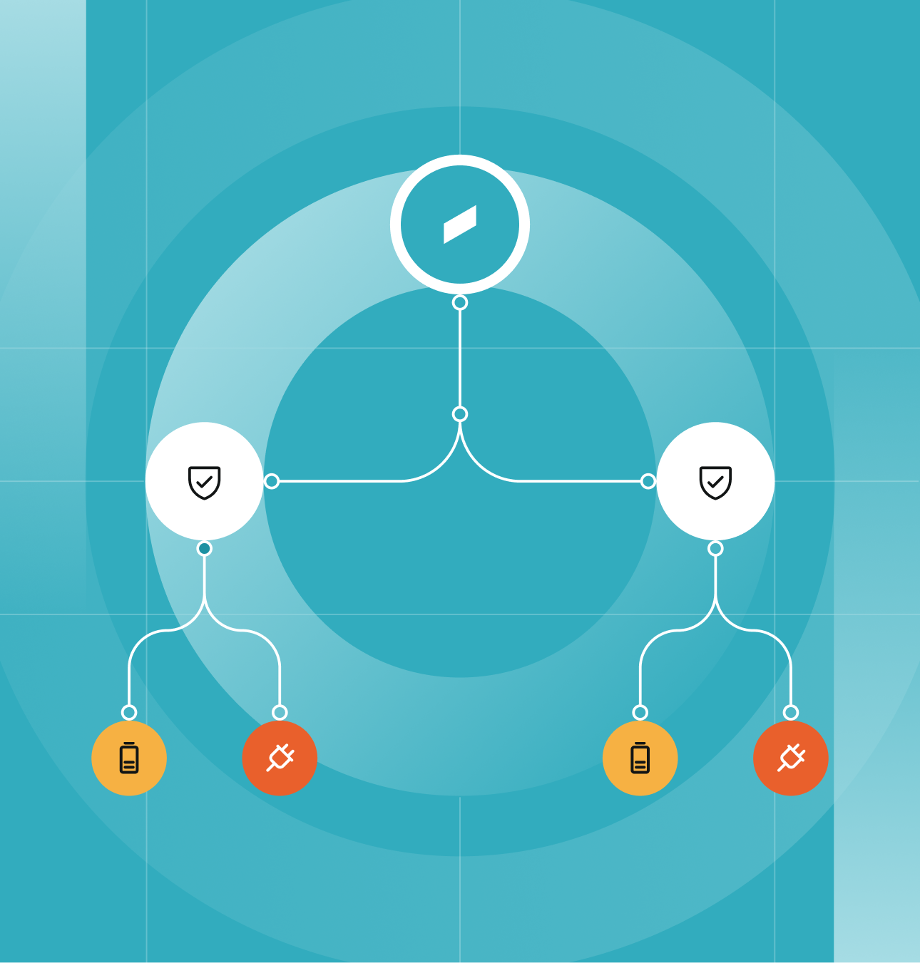
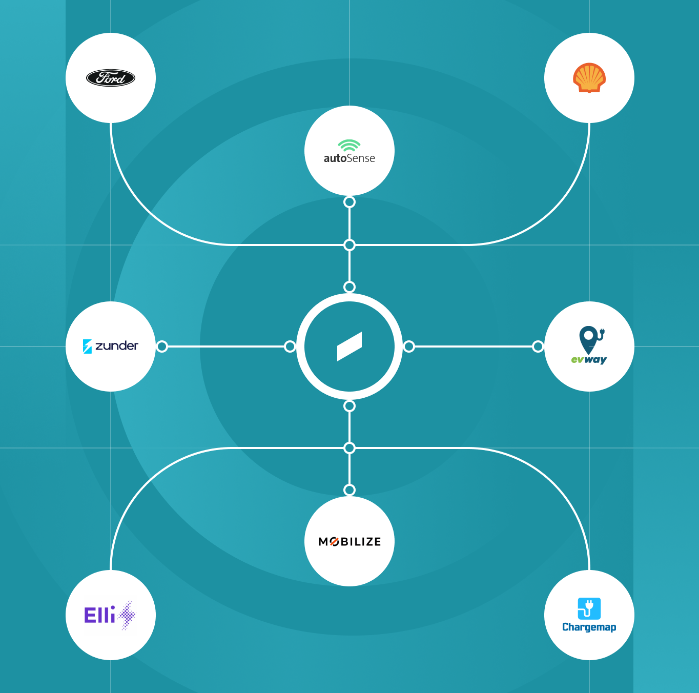
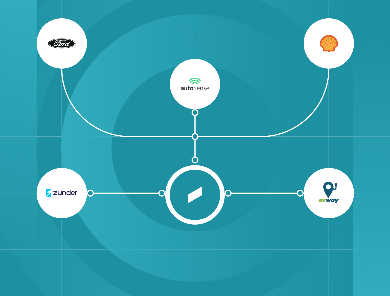
These charts extend the same lines system into something functional: thin connector strokes link round icon nodes together to show real relationships, whether that's a hierarchy or the partner ecosystem sitting around Hubject at the center.
The grid and gradient lines from the key visual stay in the background, so even a working diagram still reads as unmistakably Hubject rather than a generic chart template.



Background
Hubject Teal 300
100% opacity
Gradient lines
Hubject Teal 100
100% opacity
Hubject Teal 100
0% opacity
Strokes
White
100% opacity
Background
Hubject Signal Coral
100% opacity
Gradient lines
Hubject Signal Coral
100% opacity
White
0% opacity
Strokes
White
100% opacity
Background
Hubject Teal 500
100% opacity
Gradient lines
Hubject Teal 300
100% opacity
Hubject Teal 300
0% opacity
Strokes
White
100% opacity
07 Colors
Primary Palette
Hubject Teal 500
RGB: 29 145 162
CMYK: 74 14 27 17
Hex: #1D91A2
Hubject Teal 800
RGB: 20 114 127
CMYK: 85 40 43 0
Hex: #14727F
Hubject Teal 700
RGB: 24 132 148
CMYK: 85 33 36 0
Hex: #188494
Hubject Teal 300
RGB: 50 172 190
CMYK: 75 10 25 0
Hex: #32ACBE
Hubject Teal 100
RGB: 166 220 228
CMYK: 10 0 4 0
Hex: #A6DCE4
Secondary Palette
Hubject Offwhite
RGB: 227 239 241
CMYK: 10 0 4 0
Hex: #E3EFF1
Hubject Neutral
RGB: 206 217 217
CMYK: 23 9 15 0
Hex: #CED9D9
Hubject Signal Coral
RGB: 235 96 44
CMYK: 0 72 85 0
Hex: #EB602C
Hubject Signal Amber
RGB: 246 177 67
CMYK: 5 35 85 0
Hex: #F6B143
Baseline Color
Hubject Near Black
RGB: 18 21 21
CMYK: 75 70 65 80
Hex: #121515
White
RGB: 255 255 255
CMYK: 0 0 0 0
Hex: #FFFFFF
White
RGB: 255 255 255
CMYK: 0 0 0 0
Hex: #FFFFFF
White
RGB: 255 255 255
CMYK: 0 0 0 0
Hex: #FFFFFF
Color Combinations


08 Typography
We use FK Display and FK Grotesk Neue because they embody Hubject’s voice: confident, technical, and accessible.
FK Display is our headline voice, a single-weight display face built for scale, not decoration. Its contrasting widths and sharp letterforms give it character without feeling generic. We reserve it for hero statements, section openers, and key numbers, where size carries the weight. Used sparingly, it makes big claims land without shouting.
FK Grotesk Neue is our functional register, a neutral neo-grotesque built for clarity at any size. Its geometric, rigid forms and range of weights make it dependable across every context. It carries the everyday language of the brand: body copy, user interface, navigation, and data. Nothing about it asks to be noticed.
Together, they create a visual system that communicates expertise without intimidation, supporting our commitment to making complex technology understandable.
Secondary Typeface – Body
FK Grotesk Neue Regular
FK Grotesk Neue Medium
Font Availability and Alternatives
FK Display and FK Grotesk Neue are commercial fonts that require proper licensing and installation. They work seamlessly in desktop design software and Microsoft Office, but may not be available in web-based tools or shared documents. When they aren’t accessible, use the approved substitutes so the brand still holds together. In Google Workspace, set headlines in Host Grotesk and body copy in Inter Sans. In Microsoft Office, use Arial for both. These substitutes keep documents readable and professional, though we encourage you to use our primary typefaces whenever possible for brand consistency.
Download links for both font families are provided for Hubject employees. From the font files provided, use the OTF or TTF versions of FK Display and FK Grotesk Neue. Ignore the WOFF and WOFF2 files, those are only for websites.

Headlines
FK Display Regular
Case: Regular
Leading: 96%
Tracking: -2%
Enabling the EV ecosystem to scale
Subheads
FK Display regular
Case: Regular
Leading: 124%
Tracking: -1%
EV charging infrastructure
Body
FK Grotesk Neue Regular
Case: Regular
Leading: 150%
Tracking: 0%
The EV charging market consists of thousands of individual players, each operating their own solutions. Without a common layer, navigating it is complex, integrating into it is costly, and operating at scale is harder than it needs to be.
Caption
FK Grotesk Neue Regular
Case: Uppercase
Leading: 132%
Tracking: 10%
automation
09 Spacing & Grid
Grid
Work in progress
Desktop · 12 Columns

32 px gutter
1440 px frame
Tablet · 8 Columns
16 px gutter
768 px frame
Mobile · 6 Columns
16 px gutter
375 px frame
Padding
Work in progress
Six steps on a doubling scale 4px to 128px. Each token doubles the previous. Use token names, not raw values.
Padding/XS
--space-xs
4
0.25rem
Padding/S
--space-s
8
0.5rem
Padding/M
--space-m
16
1rem
Padding/L
--space-l
32
2rem
Padding/XL
--space-xl
64
4rem
Padding/2XL
--space-2xl
128
8rem
10 Corner Radius
Cards, containers, and layout blocks stay hard-edged and angular, keeping the same structural, grid-based logic that runs through the rest of the visual system.
Rounding is reserved for buttons, pills and icon backgrounds only. Everything else stays sharp and precise.
Radius Scale
Pill
full · buttons, pills and icon backgrounds
Cards
0px · cards, inputs
Corners

eRoaming & Network Access
Connect once and reach the world's largest cross-provider charging network. CPOs make their charge points available, eMSPs give their customers access across networks and borders.

Settlement & Clearing via Hubject Financial Services
Automate compliant financial flows and billing between charging partners, through Hubject Financial Services, a licensed payment institution.

Plug&Charge
Fully automated charging, from plug-in to payment. A capable EV authenticates and charges with no app or card, built on the trusted certificate infrastructure Hubject operates.

Security & Compliance
Trusted security infrastructure for every charging interaction, within an information security management system certified to ISO 27001.
Nesting
wont be applicable after redesign anymore
When you nest a rounded element, the outer radius should equal the inner radius plus the padding. Skip it and the corners pinch.
✗
Same radius
16
16
Inner left at 16 with no allowance for padding –the gap balloons at the corner.
✓
Concentric
16
12
4
Outer (16) − padding (4) = inner (12). The gap stays even all the way around the curve.
11 Iconography

financial services


Testing facility



Plug&charge
Icon Pack
Update coming soon
Right now we are using the icon pack below: a versatile, mixed set with icons chosen specifically for eMobility, so every visual speaks the language of EV charging.


Download
V1 — 25.03.2026
Update coming soon
12 Presentations
Hubject's PowerPoint master template translates our visual identity into a presentation format designed for clarity and impact. The template includes pre-built slide layouts, integrated color schemes, and typography settings that maintain brand consistency while allowing flexibility for different content types and audiences.
Our master template provides the foundation for all Hubject presentations. Rather than starting with blank slides or generic templates, the master deck gives you structured layouts designed specifically for the types of content we regularly present: from technical specifications to partnership announcements to industry thought leadership.
Building Effective Presentations
Presentations communicate differently than documents. Each slide should convey one clear point, using visuals to reinforce rather than replace spoken content. The master template's layouts are organized by content type (introductory slides, content with imagery, structured information, diagrams) to help you choose the format that best serves your message rather than forcing content into mismatched structures.
Keep text minimal. If a slide requires paragraphs to communicate its point, that content belongs in a document, not a presentation. Use the pre-built diagram and icon layouts as starting points for visual explanations of technical concepts or processes.
Maintaining Consistency
Custom slide layouts created outside the master template dilute brand consistency and create visual fragmentation across our communications. If you need a layout type not included in the template, contact the marketing team rather than building it independently. We'll either point you to an existing option or create a new layout that can be added to the master for everyone's use.
Avoid excessive animations, transitions, or external branding elements that compete with Hubject's visual identity. Presentations should feel professional and polished, not distracting.
How the Master Deck is meant to be used when building a new presentation:
- Open the Master Deck.
- Use "Save As" straight away to create a new file with your chosen name, so the original Master Deck stays untouched.
- Find the sample slide that best fits the content you have in mind. Copy it (CTRL+C) and paste it (CTRL+V) at the top of the deck, then edit it with your own content.
- Repeat step 3 for each slide you need, working from the sample slides down.
- Once you are finished, delete all the remaining sample slides so only your final presentation is left.
13 Photography
Hubject's photography reflects our brand voice: professional, grounded, and focused on the practical reality of charging infrastructure. Our images show charging as it actually happens, not as a futuristic fantasy.
Communicate Seamlessness Photography should convey the effortless nature of charging that Hubject enables. Show the simplicity of connection, the integration into daily life, the absence of friction. Charging should appear as natural and unremarkable as plugging in any device.

Subject Focus
Primary: Charging Infrastructure
The charging point, connection, and hardware are the heroes of our images. Vehicles and people provide context but don't dominate the frame.
Secondary: Real-World Context
Show charging in authentic operational environments: urban streets, depot facilities, parking areas. Avoid studio settings or overly staged scenarios.
Include Commercial Vehicles
Buses, trucks, and fleet vehicles are as important as passenger cars. Our B2B focus means showing diverse vehicle types that reflect our customers' operations.


Visual Style


Clean and Professional
Compositions are uncluttered and purposeful. Remove visual noise that distracts from the subject. Use shallow depth of field to create focus and polish.
Natural Lighting Preferred
Favor natural light that shows real-world conditions. Golden hour warmth is acceptable. Avoid harsh artificial lighting or heavy post-processing that makes scenes feel manufactured.
Realistic, Not Futuristic
Show charging infrastructure as it exists today, not conceptual visions. Real charging stations, actual vehicles, genuine operational contexts.
Muted, Professional Palette
Colors should feel natural and grounded. Avoid oversaturated or stylized color grading. Let the environment's authentic colors come through.
Composition Guidelines
Show Seamless Integration
Capture charging as an effortless part of everyday routines. Vehicles charging during normal activities (parked on streets, at depots during shifts, in residential areas). The ease of connection should be visually apparent.
Environmental Context
Include enough background to establish setting (urban, rural, depot, street) without overwhelming the primary subject. Background should be slightly out of focus.
Close-Ups of Connection Points
The moment of connection (cable to vehicle, hand on connector) should look simple and natural, not complicated. Show the elegance of the charging interface, the straightforward nature of plug-and-charge.
Authentic Settings
Urban streets with real architecture, operational depot environments, actual parking facilities. Settings should feel harmonious with local context but not overtly geographic.


People in Photography
Operational, Not Performative
When people appear, they're engaged in actual tasks: connecting chargers, monitoring equipment, working in operational settings. Not posing, not looking at camera.
Minimal Presence
People provide scale and context but aren't the focus. Keep human subjects secondary to infrastructure.


Image Creation
Professional Photography
Commission professional photographers for event coverage, partner facilities, and key campaign imagery. Brief photographers on Hubject's visual style before shoots.
AI-Generated Imagery
We use AI image generation to create charging scenarios that align with Hubject's visual standards. AI-generated images maintain the same professional, realistic aesthetic as our photography: grounded, operational, and focused on actual charging infrastructure rather than futuristic concepts. Only the marketing team creates AI-generated imagery for Hubject.
If you need AI-generated images for your project, create a ticket with your requirements (subject matter, setting, intended use) and submit it to the marketing team. We'll generate images that meet our brand standards and ensure visual consistency across all materials.
Never Use Stock Photography
Hubject creates all imagery in-house through professional photography or AI generation. Stock libraries dilute brand consistency and lack the specific authenticity our communications require.
What to Avoid
Staged Scenarios
No models pretending to charge, no forced smiles, no "excited person pointing at charger" clichés.

Overly Conceptual
Avoid abstract representations, digital overlays, or futuristic visualizations that distance from practical reality.
Heavy Post-Processing
No extreme color grading, excessive filters, or artificial effects. Keep post-production subtle and professional.
Tone Of Voice
14 General Guide
Hubject's tone of voice reflects who we are: the global leader in eMobility interoperability, committed to making complex technology accessible and transformative.
Our Voice Characteristics
Human, Not Robotic
We're a technology company, but we communicate like people, not machines. Our language is warm, direct, and conversational, avoiding the stilted corporate-speak that distances brands from their audiences.
Expert, Yet Accessible
We possess deep technical knowledge, but we don't hide behind jargon. We translate complexity into clarity, ensuring that everyone from automotive engineers to environmental journalists can understand and engage with our innovations.
Confident, Not Arrogant
We're leaders in our field, and our communication reflects that authority. But confidence means inviting collaboration, not dictating terms. We lead by example and inspiration, not by dominance.
Visionary, Yet Practical
We articulate bold visions for eMobility's future while grounding them in real-world application. Our innovations aren't theoretical. They're solving today's challenges while building tomorrow's infrastructure.
Keeping our voice consistent, with a little Claude
Writing in Hubject's voice should never feel like guesswork. To make it easier, we have built a dedicated Claude skill that captures our full tone of voice: the four brand pillars, our style rules, the approved boilerplate, and format-specific guidance for everything from press releases to LinkedIn posts.
The skill is available to everyone at Hubject. It works automatically in the background whenever you use Claude, so there is nothing to switch on and nothing to configure. Ask Claude to write or review any external-facing content, whether that is a blog post, a product page, or a sales email, and it will apply our brand voice for you. The result is content that stays on brand, sounds like us, and saves you time.
If you run into any trouble accessing the skill or getting it to work, our IT team is here to help. Reach out to them and they will get you set up.
15 Naming Standards
How products, sub-brands and features are named and written, so offerings stay consistent across every touchpoint.
Primary Technical Terms
DO
DON’T
EV

EV / EVs (plural)

e.V. - EV's - electric vehicle
eMobility
eMobility (lowercase 'm')
e-Mobility - emobility - e-mobility
eRoaming
eRoaming (lowercase 'r')
e-Roaming - eroaming - e Roaming
Stakeholder Abbreviations
DO
DON’T
CPO
CPO / CPOs (plural) - Charge Point Operator
(no variant - just use CPO)
EMP
EMP / EMPs - eMobility Provider
eMSP - do not use this variant
OEM
OEM - for EV manufacturers only
Use for non-EV manufacturers
MO
MO - Mobility Operator
(use only for broader mobility operators)
Always expand on first use - e.g. 'eMobility Providers (EMPs)'
Product Names
DO
DON’T
intercharge
Inter-charge - InterCharge - INTERCHARGE
intercharge for CPO - intercharge for EMP
Intercharge CPO - Intercharge/EMP - IFC
intercharge DIRECT
Intercharge Direct - InterchargeDirect
intercharge ETICKET
Intercharge eTicket - Intercharge E-Ticket
Plug&Charge
Plug and Charge - Plug & Charge - PnC
Compatibility Check
COMPATIBILITY CHECK - compatibility check
Product names use Title Case; capabilities use Title Case when referring to them formally.
External Standards
DO
DON’T
ISO 15118
ISO-15118 - 15118 - the ISO standard
ISO 15118-2 - ISO 15118-20
ISO 15118 - 2 - ISO 15118 -2
ISO 27001
ISO-27001 - 27001 - ISO27001
Open Charge Point Interface (OCPI) - OCPI 2.2.1
ocpi - O.C.P.I. - OCPI2.2.1 - OCPI-2.2.1
No abbreviations – always use the full code. No spaces between any extensions like -2 & -20.
16 The Four Voice Pillars
Our brand voice rests on four foundational pillars that guide every piece of communication we create. These aren't abstract concepts. They're practical filters that help us communicate consistently and effectively across all channels.
Voice Pillar 1
Expert Clarity
Communication that simplifies complexity without oversimplification, making sophisticated technical concepts accessible to diverse audiences while maintaining authority.
Why This Matters
In the eMobility sector, stakeholders range from electrical engineers who design charging systems to policymakers who regulate them. Expert Clarity ensures we honor our Curious and Inclusive values by making knowledge accessible to everyone who influences EV adoption.
Technical jargon creates barriers. When we describe "ISO15118 protocol implementation" without context, we alienate journalists, policymakers, and business decision-makers who lack engineering backgrounds but wield significant influence. If we can't explain why interoperability matters in accessible terms, we limit our impact.
Expert Clarity transforms technical authority into market influence by:
- Building confidence among technical decision-makers evaluating our solutions
- Providing journalists with stories they can share with mass audiences
- Helping policymakers understand regulatory implications
- Demonstrating mastery through the ability to explain, not obscure
Common Mistakes to Avoid

Oversimplification that loses meaning "Plug&Charge is easy charging." (Too vague. Doesn't explain what makes it easy)

Simplification that maintains substance: "Plug&Charge eliminates authentication steps. Your car and charger communicate automatically, so you just plug in and walk away."

Jargon without context "Our OCPI implementation facilitates eMSP-CPO integration." (Assumes audience knows these acronyms)

Technical accuracy with accessibility "Our platform connects eMobility Service Providers (the companies drivers sign up with) to Charge Point Operators (who run the charging stations), creating seamless access across networks."
Condescending tone "Let us explain this complex technology in simple terms for you." (Implies the audience lacks intelligence)

Respectful accessibility "The technology behind interoperability is sophisticated. Here's what it means for your operations." (Acknowledges complexity while providing clarity)
Common Mistakes to Avoid
Vague future promises "We're revolutionizing the charging experience." (No evidence, no timeframe, no specifics)

Grounded innovation claims "Our latest protocol update reduces charging session initiation time from 12 seconds to under 3. A change that improves user experience today while laying groundwork for ultra-fast charging that's coming to market next year."
Innovation without application "Our advanced algorithms optimize charging efficiency." (Doesn't explain what this means in practice)

Innovation with concrete outcomes "Our smart charging algorithms reduced peak demand charges by 23% for CPOs in our pilot program, lowering operational costs while improving grid stability. This optimization is now available to all partners across our network."
Theory without evidence "Interoperability will transform the industry." (Future tense, no current proof)

Proven transformation "Interoperability is already transforming regional markets. In Scandinavia, our platform increased average charging network size by 400% when previously isolated operators connected through our ecosystem, directly contributing to the region's 80%+ EV adoption rate."
Voice Pillar 2
Practical Innovation
Forward-thinking communication grounded in real-world application, demonstrating how today's innovations solve current challenges while building tomorrow's infrastructure.
Why This Matters
Practical Innovation bridges our Ambitious and Accountable values. In an industry where "innovation" often means vaporware and distant promises, we demonstrate that our advancements deliver measurable value today while positioning stakeholders for future growth.
For CPOs making infrastructure investments, Practical Innovation shows that our protocols aren't experimental:they're proven solutions working across 70+ countries. For OEMs integrating charging capabilities, it demonstrates that our standards enable current models while supporting upcoming technologies. For policymakers evaluating regulations, it proves that interoperability works in practice, not just theory.
Practical Innovation transforms ambitious visions into credible commitments by:
Grounding future-focused claims in current implementations
Providing measurable outcomes alongside innovative features
Demonstrating how innovations solve real operational challenges
Showing the path from today's capabilities to tomorrow's possibilities
Voice Pillar 3
Collaborative Leadership
Confident guidance that invites partnership, demonstrating market leadership through ecosystem enablement rather than market dominance.
Why This Matters
Collaborative Leadership embodies our Inclusive and Accountable values while addressing a critical perception: Hubject holds significant influence in European eMobility markets. Rather than downplaying this position or wielding it as control, we demonstrate that our market leadership serves a greater mission. Accelerating sustainable mobility through genuine collaboration.
For charge point operators, this pillar shows that joining our ecosystem enhances their competitive position rather than diminishing it. For OEMs, it proves that standardization creates more value than proprietary approaches. For policymakers assessing market dynamics, it demonstrates that our influence benefits the entire industry's growth.
Collaborative Leadership transforms market position into collective progress by:
Framing partnerships as mutual advancement, not supplier relationships
Acknowledging diverse contributions to industry standards
Demonstrating how network effects benefit all participants
Positioning success as shared achievement rather than competitive advantage
Common Mistakes to Avoid
Dominant language: "Hubject controls the European charging network." (Suggests monopoly rather than ecosystem leadership)

Collaborative leadership: "Hubject's platform connects the European charging ecosystem, enabling operators of all sizes to participate in cross-border charging networks."
One-sided partnership framing: "We're bringing advanced interoperability to [Partner's] network." (Implies the partner is merely receiving, not contributing)

Mutual value recognition: "Together with [Partner], we're combining their market-leading customer experience platform with our interoperability protocols to create seamless charging that benefits drivers and operators alike."
Competitive positioning: "Unlike other platforms, Hubject offers true interoperability." (Criticizes competitors rather than demonstrating value)

Value-based differentiation: "Our approach prioritizes protocol-agnostic interoperability, ensuring that operators can maintain their existing systems while gaining access to international charging networks. This flexibility allows diverse solutions to coexist while serving drivers' needs for seamless charging."
Common Mistakes to Avoid
Feature-focused communication: "Our platform now supports OCPP 2.0.1." (Technical fact without business context)

Market enablement framing: "OCPP 2.0.1 support future-proofs your charging infrastructure, enabling smart charging, V2G capabilities, and dynamic pricing; features that will differentiate your network as EV adoption scales and driver expectations evolve. Early adoption positions you competitively for the premium services that will drive margins in maturing markets."
Stopping at B2B value: "Our interoperability platform increases CPO revenue potential." (Doesn't connect to end-user or societal benefit)

Complete value chain: "Our interoperability platform increases CPO revenue by expanding their accessible customer base, which means drivers encounter more compatible charging options, reducing range anxiety. As charging reliability improves, EV adoption accelerates, creating the market growth that benefits every ecosystem participant while advancing transportation decarbonization."
Generic impact claims: "We're making the world more sustainable." (Too vague, no causal connection shown)

Traced impact pathway: "By making charging infrastructure interoperable, we remove technical barriers that have fragmented the charging experience. Better charging experiences increase consumer confidence in EVs, accelerating adoption. Each percentage point increase in EV adoption represents significant emissions reductions, particularly in urban areas where air quality directly impacts public health."
Voice Pillar 4
Market Enablement
Technology explained through its effect on business success and industry advancement, connecting technical features to business growth, improved customer experiences, and ultimately, societal and environmental impact.
Why This Matters
Market Enablement expresses our Curious and Ambitious values by expanding our perspective beyond technical achievement to ecosystem transformation. This pillar ensures we consistently "zoom out" from specific solutions to their broader implications. How they enable businesses to thrive, how those businesses serve drivers better, and how improved charging experiences accelerate EV adoption's environmental benefits.
For charge point operators, this pillar transforms "interoperability protocols" into "expanded revenue opportunities and competitive differentiation." For eMSPs, it connects "network expansion" to "customer retention and market positioning." For OEMs, it links "charging standards" to "product innovation and consumer confidence." In each case, we trace the value chain from our B2B solutions to end-user benefits to societal impact.
Market Enablement demonstrates complete value creation by:
Translating technical features into quantifiable business outcomes
Connecting business success to improved consumer experiences
Showing how better experiences accelerate EV adoption
Linking adoption growth to environmental and societal benefits
17 Social Media Tonality
LinkedIn is Hubject's primary social media platform for B2B thought leadership, industry insights, and professional community engagement. While we maintain professionalism, our LinkedIn voice should feel more accessible and engaging than formal corporate channels.
LinkedIn Guidelines
LinkedIn is where we build thought leadership, share industry insights, and engage with our professional community.
LinkedIn Best Practices
- Lead with insights or questions, not announcements
- Provide value even to those not directly buying our solutions
- Use clear, specific examples over abstract concepts
- Limit hashtags to 3-5 relevant terms
- Engage genuinely with comments. Add value, don't just thank people
- Tag partners and stakeholders when relevant (with their permission)
Voice Characteristics
Professional but conversational
Insight-driven and educational
Industry-focused with broader relevance
Confident without being promotional
What This Looks Like

Strong LinkedIn Post
Range anxiety isn't solved by adding more charging stations. It's solved by making existing infrastructure reliably accessible.
When charging networks operate in silos, drivers face uncertainty. When they're interoperable, every station becomes part of a unified ecosystem.
Our platform now connects 1,000,000+ charging points across 70+ countries. For CPOs, this means broader customer reach. For drivers, it means charging confidence.
Interoperability transforms infrastructure abundance into actual accessibility.
#eMobility #EVCharging #Interoperability"
Analysis: Leads with insight, provides value, connects to business outcomes, ends with perspective.
Weak LinkedIn Post
Exciting news! Hubject is growing! Check out our latest expansion 🎉
Link: [url]
#eMobility #EVs #Charging #Sustainability #Innovation #Future
Analysis: Analysis: Generic excitement, no substance, excessive hashtags, purely promotional.
LinkedIn Engagement Guidelines: Responding to Comments
Respond Authentically
When engaging with comments and questions, provide genuine value.

Good response
Great question! Dynamic load management essentially lets charging stations 'talk' to each other and to the grid, distributing power intelligently based on real-time demand. For fleet operators, this can reduce energy costs by up to 30% while ensuring all vehicles charge fully overnight.


Poor Response
Thanks for your interest! Check out our white paper for more info: [link]
Handle Criticism Professionally
When facing critical comments, acknowledge concerns and provide factual responses without defensiveness.

Good response
We appreciate this feedback. You're right that charging reliability varies by region. It's exactly why we're working with local operators to improve uptime and availability data. The challenge is real, and we're committed to being part of the solution.
Poor Response
Our platform has 99.2% uptime. Perhaps check your settings or contact your service provider.
Handle Criticism Professionally
When facing critical comments, acknowledge concerns and provide factual responses without defensiveness.

Good response
Huge congratulations to @PartnerName on reaching 10,000 charging sessions this month! This is what ecosystem success looks like. When our partners thrive, the entire industry advances. 🎉
Hashtag Strategy
Industry Standard Hashtags (Always Relevant):
#eMobility #EVcharging #ElectricVehicles #Interoperability
Topic-Specific Hashtags (Use When Relevant):
#PlugAndCharge #eRoaming #FleetElectrification #ChargingInfrastructure #SmartCharging
Event Hashtags:
#icnc25 #[EventName]
What to Avoid
- Generic hashtags (#innovation, #future, #technology)
- Excessive hashtag strings (limit to 3-5 per post)
- Trending hashtags unrelated to our content
Development
18 URL Style
A URL's path should describe the destination's purpose and content - readable by a human before a click - not just carry the brand or an opaque ID.
Pattern - lowercase, hyphenated, hierarchical /section/topic, stable, no IDs or query params for content (examples illustrative)
DO
DON'T
hubject.com/products/intercharge-cpo
hubject.com/company/about
hubject.com/products/plug-and-charge
hubject.com/products/InterchargeCPO
hubject.com/page?id=4827
hubject.com/hubject-about-hubject
• Words separated by hyphens, all lowercase
• Hierarchy mirrors site structure (/section/sub-topic)
• Permanent & stable - set redirects rather than changing live URLs
• Locale prefix where needed (/en/, /de/)
19 Web Components
Our web components are the building blocks of every Hubject digital experience. They turn our brand into something people can click, type into, and navigate, so that every touchpoint feels consistent, accessible, and unmistakably ours. Getting these details right is how we make sophisticated technology feel effortless: the same principle that guides our products should guide our interfaces.
This section brings together the core elements you will use most often. Buttons signal action and guide people forward. Input fields make interactions clear and reduce friction at every step. The navigation bar keeps users oriented, so they always know where they are and where they can go. Card styles give structure to content, grouping information in a way that is easy to scan and pleasant to explore.
When we build from the same foundation, we create a seamless experience for every user and a stronger brand for all of us.
Buttons
Every button is a clear invitation to move forward: start a process, confirm a choice, or open the next step. Its job is to be instantly recognisable and effortless to use, so the action feels obvious rather than something the user has to hunt for.
Use buttons for the moments that matter most. A primary button highlights the main action on a screen and should appear only once per view, so it never has to compete for attention. Secondary and tertiary buttons support that action without overshadowing it. When the labels are clear and the hierarchy is consistent, people always know what will happen next, and that confidence is what makes an interface feel seamless.
Padding

Default
24 px


16 px
Primary large

Default
Hover
Pressed

Disabled
Primary small

Default
Hover
Pressed

Disabled
Secondary large
Default
Hover
Pressed
Disabled
Secondary small
Default
Hover
Pressed
Disabled
Tertiary large

Default
Hover
Pressed
Disabled
Tertiary small

Default
Hover
Pressed
Disabled
Ghost large
Default
Hover
Pressed
Disabled
Ghost small
Default
Hover
Pressed
Disabled
Custom Buttons
Pagination

Tabs
Whitepaper & Reports
Press releases
Latest news

Newsletter
Email address

Subscribe
Menu
English
Deutsch
Français
Español
中文
български
Social buttons


Navigation
The navigation gives people access to every area of the site from wherever they are. It is the map that keeps a large site feeling simple, so users always know how to get where they want to go.
Selecting a dropdown item opens a menu with every link in that category, so people can scan all their options at once instead of guessing which page holds what they need. Clear categories and predictable behaviour turn even a broad site structure into something that feels easy to navigate.

Input Fields
Input fields are where people give us information: a name, an email address, a search term, a charging preference. Their job is to make that exchange feel simple and reassuring, so users always know what to enter and feel confident they got it right.
A good input field guides from start to finish. A clear label sets the expectation, helpful placeholder text or hints reduce guesswork, and visible states for focus, error, and success tell people exactly where they stand. When we keep validation friendly and messages specific, we turn a potential point of friction into a smooth step forward. The less users have to think about the form, the more they can focus on what they came to do.
Default
Name*
Placeholder
Active
Name*
Text|
Filled
Name*
Text
Error
Name*
Text
Error message goes here
Default
Name*
Placeholder

Active
Name*
Text|
Filled
Name*
Text
Error
Name*
Text
Error message goes here
Headline Modules
Headline modules give every section a clear starting point. Built from a tag, a headline, and body copy, with an optional button or navigation element, they introduce a topic at a glance and set the visual hierarchy for everything that follows.
Each module adapts without extra work. Choose left or center alignment to match the layout, and select the right heading level, H1, H2, or H3, while predefined spacing tokens keep the rhythm consistent across every page. Built for modularity and speed, headline modules let teams assemble new sections quickly, without sacrificing consistency.

Tag
Clear H1 headline goes here
Use this text to expand on your headline. Keep it short and clear.
Primary
Secondary

3500+
B2B Partners
75+
Countries
1.1M+
Charge Points
Tag
Clear H1 headline goes here
Use this text to expand on your headline. Keep it short and clear.
Primary
Secondary
3500+
B2B Partners
75+
Countries
1.1M+
Charge Points
Tag
Clear H2 headline goes here
Use this text to expand on your headline. Keep it short and clear.
Primary
Secondary
Tag
Clear H2 headline goes here
Use this text to expand on your headline. Keep it short and clear.
Primary
Secondary
Tag
Clear H3 headline goes here
Use this text to expand on your headline. Keep it short and clear.
Primary
Secondary
Tag
Clear H3 headline goes here
Use this text to expand on your headline. Keep it short and clear.
Primary
Secondary
Footer
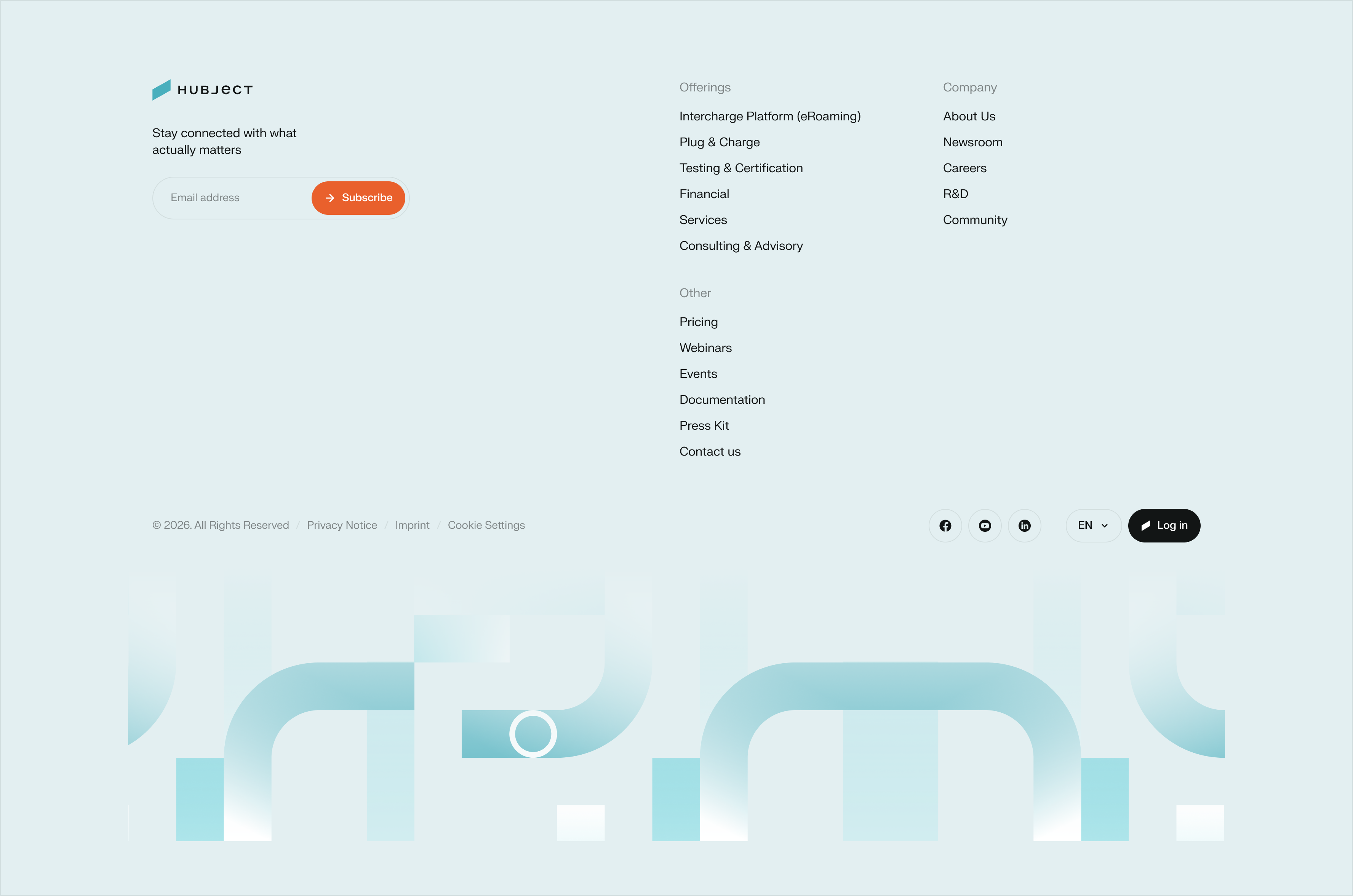
The footer is where a page closes but the relationship continues. It gives people a reliable place to find what the main navigation does not always show: contact details, legal links, social channels, and a way back to the key sections of the site. A strong footer means no one ever reaches a dead end.
Structure and consistency matter most here. Group links logically, keep hierarchy clear with headings for each column, and always include the essentials: imprint, privacy policy, and contact information. Keep the tone and spacing consistent with the rest of the page, so the footer feels like a natural conclusion rather than an afterthought. Done well, it reinforces trust and gives every visitor a clear next step, wherever they are in their journey.
Cards
Cards give content a home. They group related information such as an image, a title, a short description, and an optional tag or button, into a single, self-contained unit that is easy to scan and simple to compare against others. Wherever people need to browse options, from charging partners to blog articles, cards turn a list into something inviting to explore.
Consistency is what makes a card system work. Keep spacing, corner radius, and shadow depth the same across every variant, so cards feel like one family even as content changes. Support different layouts, vertical for content grids, horizontal for compact lists, and clear hover and focus states so people always know a card is interactive. Built well, a card style scales from three items to three hundred without losing clarity.

eRoaming & Network Access
Connect once and reach the world's largest cross-provider charging network. CPOs make their charge points available, eMSPs give their customers access across networks and borders.
Simple Card, can also be used in a grid

Long Card
What to Avoid
Avoid placing the dot pattern over important elements within the image.
Ensure that key visual details remain clear and unobstructed to maintain focus and readability.

Avoid using multiple colors within a single card.
Keep each card visually consistent by using one primary color treatment.

Avoid placing dots in random positions or using inconsistent spacing between them.
Maintain a structured and consistent pattern to ensure visual harmony.

Section: How it works
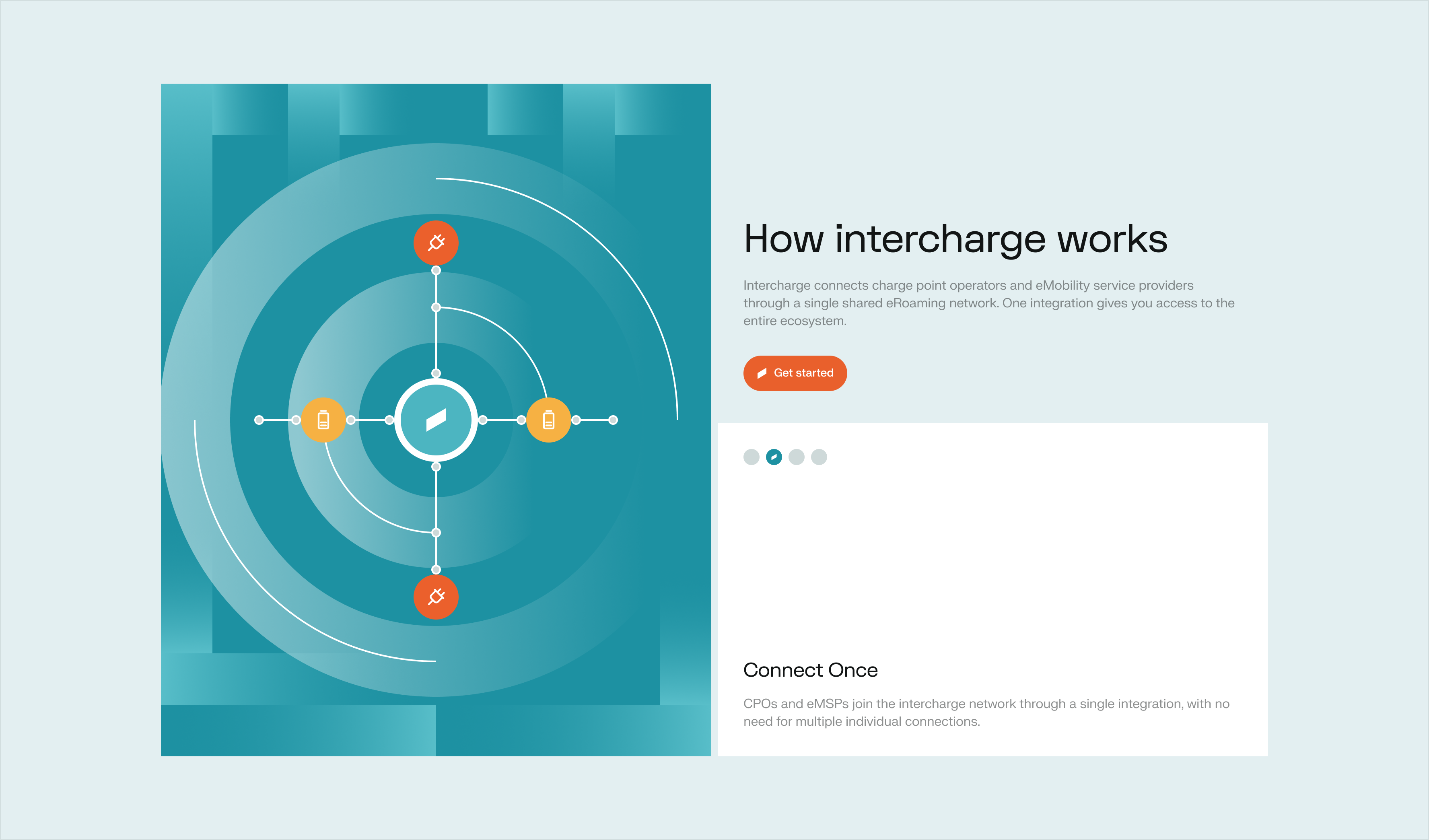
This process card comes alive as people scroll. Instead of clicking through separate steps, users move down the page and watch the content update automatically, each stage revealing itself at exactly the right moment. It turns a simple scroll into a guided journey.
The result is a walkthrough that feels effortless. There is nothing to click and nothing to figure out, just a natural rhythm between reading and discovering. This makes it a strong fit for explaining a process, a journey, or a set of steps in a way that keeps people engaged from start to finish.
Tabs
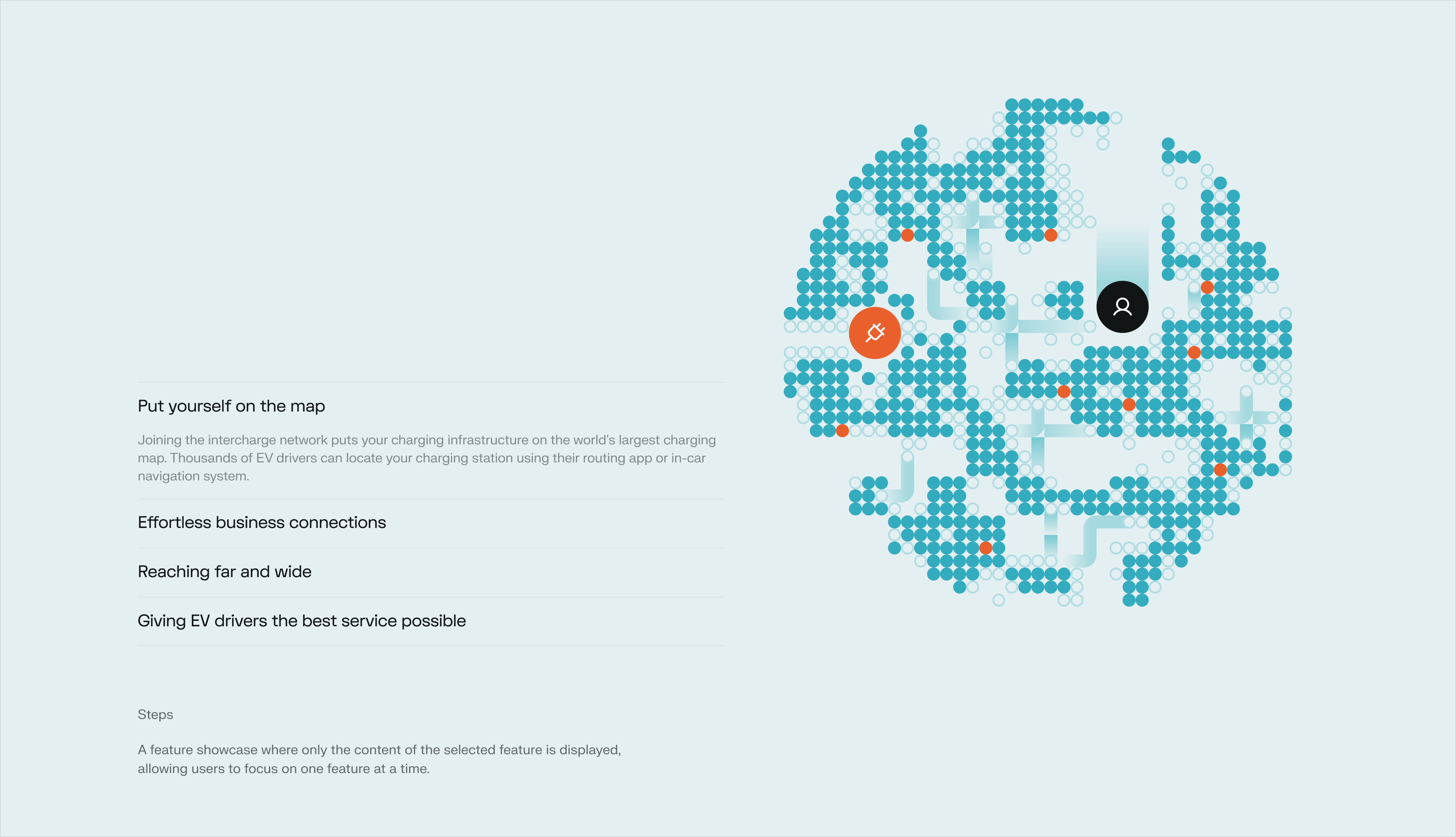
This feature showcase puts one idea in the spotlight at a time. Users select a feature and only its content appears, so attention stays on what matters most instead of competing for space with everything else on offer.
This focused approach makes even a long list of features easy to explore. Each selection brings a clean, uncluttered view, so people can move through capabilities at their own pace and actually absorb what each one offers, rather than skimming past it.
End-to-End Process Visualization
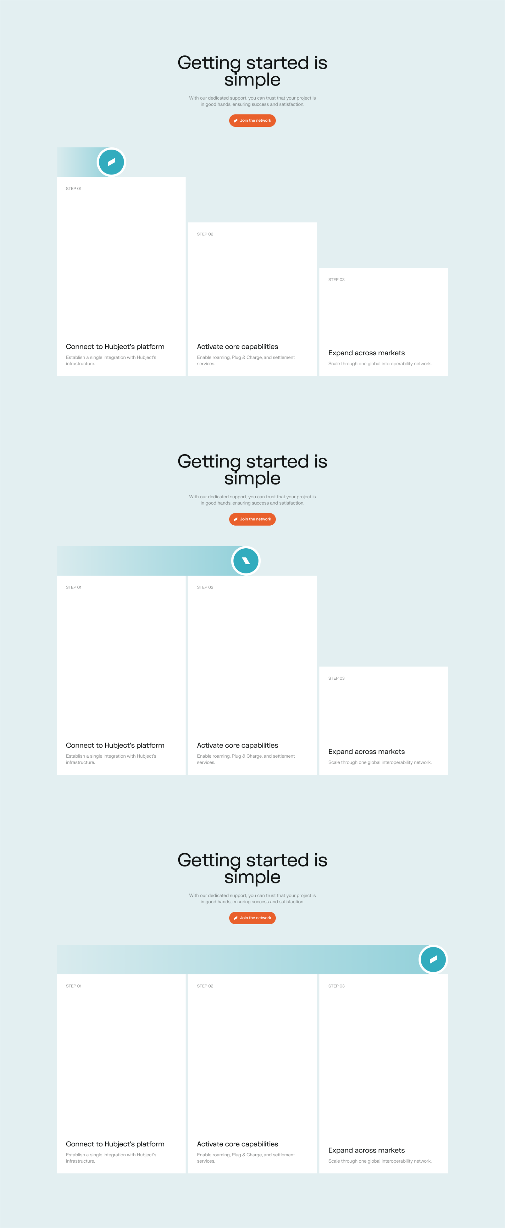
This section shows just how effortless the Hubject experience is, from start to finish. As users scroll, the Hubject logo moves through the entire flow, turning an abstract process into something visual and easy to follow.
The motion does the explaining. Instead of describing each step in text, the journey unfolds naturally as people scroll, making the simplicity of the experience something they see and feel, not just read about.
Call-to-Action Sections
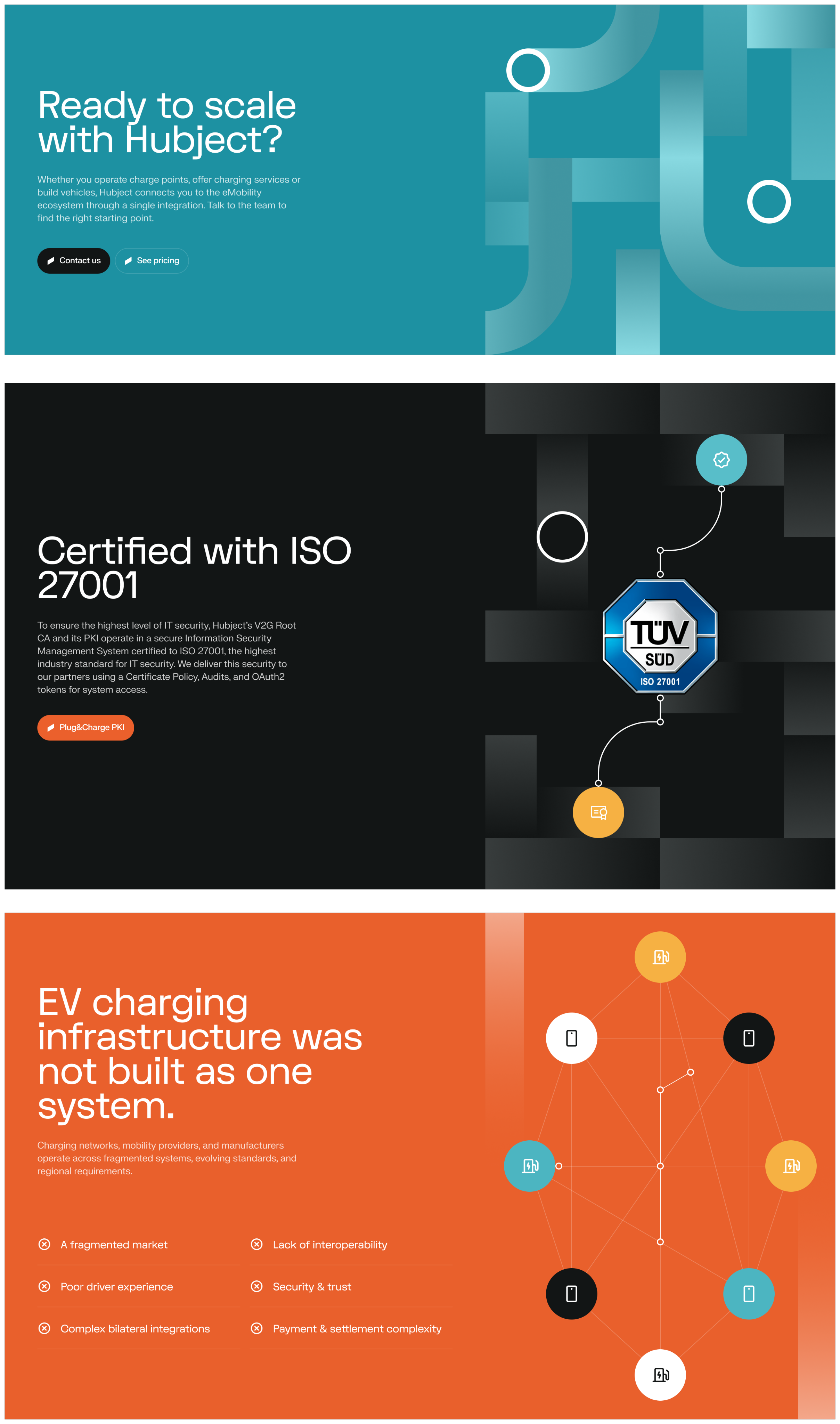
Call-to-action sections put the message that matters most front and center. Use them to promote a service, drive a contact request, or highlight information the reader should not miss. A well-placed CTA turns a passive visitor into someone taking the next step.
Color signals intent, so choose it with purpose. The default CTA uses Teal 500, our brand color, for everyday actions. Neutral CTAs use Near Black when the tone should stay calm and informational. For CTAs addressing a challenge or pain point, use Signal Coral: the stronger contrast draws extra attention and gives urgent messages the emphasis they need.
Hero Side Panel (Subpages)
The hero side panel for subpages is built from two main sections. The visual asset section holds an image or illustration that gives the subpage an immediate identity. The content section carries the page's core message in text. Together, they give every subpage a strong, consistent opening.
Most subpages also include a dot pattern at the bottom of the hero, evenly spaced with a 16px gap, adding a subtle finishing touch without competing with the content above it.
Color is what helps users recognize which subpage they are on. The current mapping is:
- intercharge: Signal Amber
- Plug&Charge: Signal Coral
- Core Capabilities: Teal 300
- Solutions: Hubject Neutral
Icon backgrounds are chosen to keep sufficient contrast against each subpage color:
- intercharge: icon on Signal Coral background
- Plug&Charge: icon on Signal Amber background
- Core Capabilities: icon on Signal Amber background
- Solutions: icon on Teal 300 background
Avoid using Near Black as an icon background wherever possible. This color is reserved for the primary CTA in the hero section, and it should stay visually prominent there rather than being shared elsewhere.


Looking Ahead
This library represents where our web components stand today, not where they end. As Hubject grows and new products, features, and use cases emerge, new components will join this collection, and existing ones will keep evolving alongside them.
We see this as a living foundation rather than a fixed set of rules. If you are building something that is not covered here, or see an opportunity to improve an existing component, reach out to the brand team. Together, we keep this library growing in a way that serves everyone building the Hubject experience.
Beta
FOR DEVELOPERS & AI
20 Implementations
Everything you need to keep output on-brand – in your AI context, your codebase, or your editor. Drop the files into a project, prompt window, or CI pipeline to enforce Hubject brand rules automatically.
BRNAD.md
.MD
AI & Content Reference
The complete Hubject brand source of truth. Drop into any AI context window – Claude, ChatGPT, Cursor, or similar – to make generated copy, code, and UI deterministic and on-brand.


AI prompts – attach as context file
Cursor / Copilot – add to .cursorrules or project docs
Content review – checklist for copywriters
hubject.tokens.json
.json
Design Tokens
All color, spacing, and radius tokens as CSS custom properties. Import into any web project for instant brand compliance. Supports light and dark mode via [data-theme] attribute.
Web projects – import into global stylesheet
Tailwind / CSS-in-JS – map to your config
Design QA – token names match Figma variables
Quick Start
Add brand context to any AI
1
Download design.md
2
Attach it to your AI conversation or add it to your project context (.cursorrules, Claude project docs, ChatGPT custom instructions)
3
Prompt normally – the AI will enforce Hubject color tokens, terminology, voice pillars, and approved claims automatically